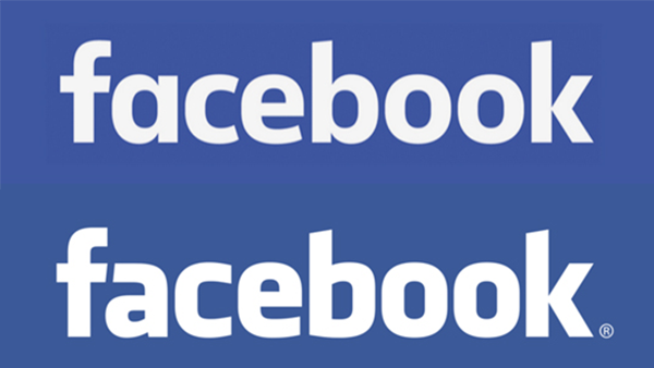
Over night Facebook has updated their logo and chances are you had absolutely no clue about it. This is actually the first time that Facebook has changed it’s logo since 2004 now. The changes are slight, but they go a long way towards making the logo look cleaner and a bit more modern. The company’s creative director, Josh Higgins, feels the new logo reflects “where we are now and where we are headed.”
Can you spot the differences? Spacing between letters has been increased, with less weight added to the font – and a totally redesigned ‘a’, ‘b’, ‘c’. Personally? I love the new logo. It doesn’t feel as Comic Sans as the old one did – and didn’t remind me just how old Facebook was. It’s a welcome change as far as I am concerned. What do you think?


