No, not the italian baroque composer from Venice, Italy; the new browser launched by Jon Stephenson von Tetzchner – one of the original developers behind Opera. See back in March 2014 the decision was made to shut down My Opera – the community that many would say helped build and establish Opera as the browser it is today. Jon had been gone from Opera for about 3 years now, however it’s understandable that he wasn’t very pleased by this change of events. To help fill the void left by the death of MyOpera – Vivaldi.net was created. An online community established for the power users that have been kicked to the curb by Opera.
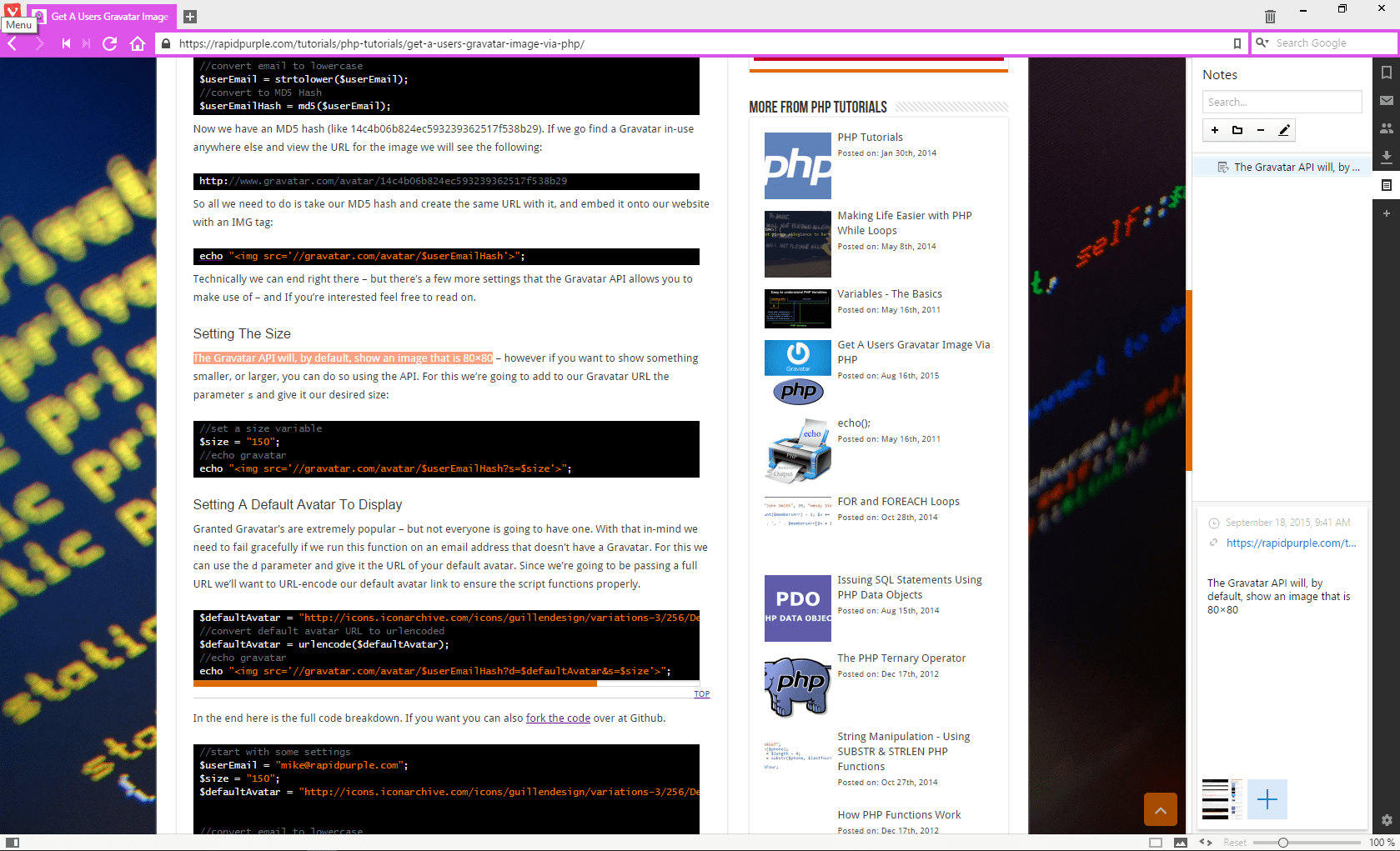
As the community grew, the Vivaldi browser was launched. A browser made by the community, for the community. Having used the browser for a couple of months now I have to say that this feels like Opera on one helluva steroid stack. It’s a beautiful browser with a growing list of awesome features. You have a color theme that is always changing to fit the main colors of the website it’s displaying, along with full control over the appearance of various UI elements like your background colors, address bar colors, tab positioning, start page customization, and more. This was clearly a browser intended for the power user and build by the power user.
Our users are developing Vivaldi at https://t.co/ucTQJE3aKq. Join in and have your say! #vivaldibrowser
— Vivaldi Browser (@vivaldibrowser) January 29, 2015
You can annotate the web pages you are browsing, add notes to your bookmarks, take a screenshot or attach a file to your note/annotation. You can add digital bookmarks directly to the sidebar. You can utilize mouse gestures and keyboard shortcuts to access almost everything from your bookmarks, to your browsing history, to the Vivaldi settings menu.
Things don’t stop there. You can utilize a “Chromeless UI” to remove most of the UI interface and have the ultimate screen real estate while working on your website design, or writing your next blog post. Users on less-than-optimal internet connections will appreciate the on-demand image loading functionality within Vivaldi – allowing you to select if all images on a webpage should be loaded, or just the cached ones, or none at all.
Oh, and let’s not forget spatial navigation. This lets you browse through the various links on the webpage you’re browsing by simply holding the shift key and using your arrow keys to travel to the link you want to get to.
The community at Vivaldi still has a ways to go. It’s based off EasySocial – a Joomla social networking extension with not much really customized; and the existing webmail offered is merely Roundcube with the logo changed. Vivaldi does state on their homepage that there will be an integrated email client called M3 coming soon – and I’m anxious to see what that will look like.
If all of this sounds as awesome to you as it does to me – head on over and download Vivaldi for yourself. Let me know in the comments what you think.

