In a day when major search engines reward mobile friendly websites, and the average Internet user basically demands it – how can it be considered ok for the majority of government websites to still be so outdated?
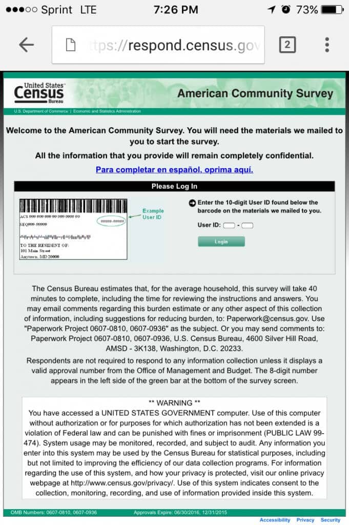
I recently got a letter from the Census Bureau requesting (by law, so no actual choice exists) that I fill out an online survey. So I figure I’ll do this while upon my throne in the morning – only to find out that I have to use a totally out of date, non-responsive website with form fields I have to constantly pinch-to-zoom if I wish to have any hopes of using them. I was in for a very frustrating next 10 minutes.
So I closed the browser and made a mental note to do the survey at work on my desktop. Why? It’s less annoying. BUT WAIT! Wouldn’t it have made more sense to make the survey a friendly, responsive design that allowed me to easily fill it out regardless of what device I was using? That way more responses can be acquired in a shorter period of time since you wouldn’t have users like me putting it off just because we’re forced to use a specific device. Maybe then I wouldn’t feel so annoyed at having to go through this entire process?
Online advertisers and marketers have long made sure that lead generation forms and landing pages were designed to make things as simple and straight forward for the user as possible – so how is it that the majority of government websites that you regularly have to use don’t follow these very same core principles?
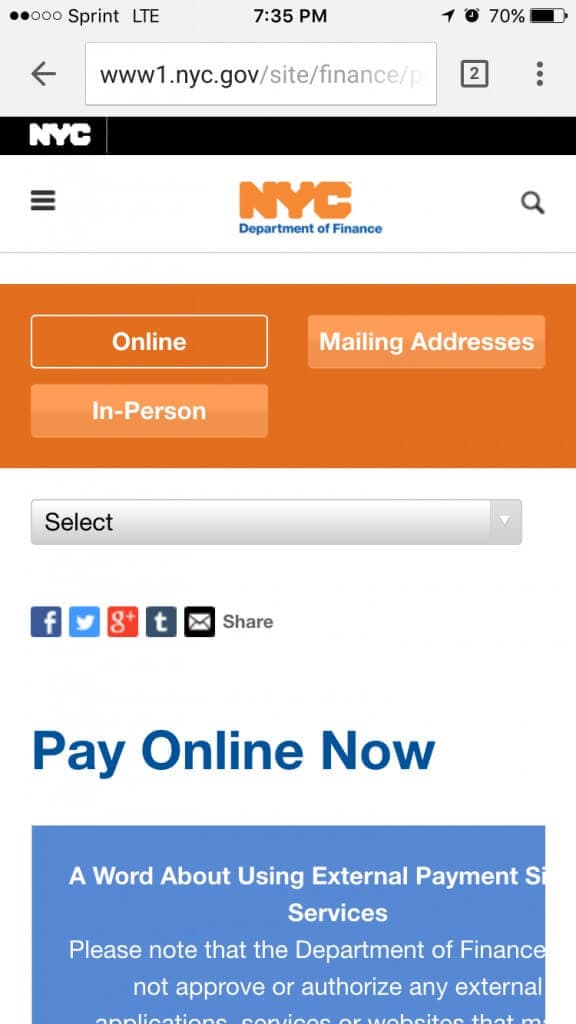
Ok – let’s leave this survey alone for a moment. Let’s go pay a parking ticket. We start off on what looks to be a responsive website – mostly.
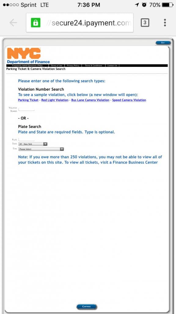
And as if a preview of things to come, the next link we click brings us to our favorite, non-responsive, table based layout:
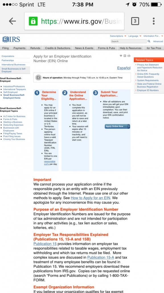
Alright, alright. Surely if we must register a new Employee ID Number we’ll be on a responsive website right?
I am at a loss. How is it that we can’t allocate the funds to let a designer run through the Census survey and make it a little bit more mobile friendly? And New York – I’m just disappointed with you. This is exactly why you didn’t even make it on the list as a top tech city. Most of your online portals and services are extremely out of date – and short of adding captcha to some online applications – you haven’t made an update in years.
Look – if you want to get the most out of your online application you need to make it easily accessible across all of today’s devices. People are on their phones all the time – and I promise you there will be a lot less annoyed phone calls and a lot more successful applications should you do this.
