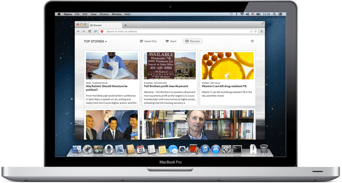
Way before Google Chrome was ever released I was a die-hard Opera Browser fan. At the time it was the fastest browser out there and had some pretty awesome features. Over these past few years I’ve been using Google Chrome, however with Opera’s latest beta release, I might just have to make the switch back to Opera.
Before I say anything let me just note that currently I am using Google a Chrome 37 and have been using Opera Beta for 2 days now as a replacement of Chrome. Now that said things just feel smoother with Opera 25 for me. And it’s important to note that Google Chrome never really felt slow for me in the past, yet Opera just somehow feels quicker. Maybe it’s the rendering capabilities it has, after all it does seem to best out Google Chrome in the HTML5Test.
Furthermore Opera 25 scored significantly higher on the Futuremark Peacekeeper Browser Test than Google Chrome.
Now the new release of Opera 25 did bring about some great new features – such as the ability for bookmarking which unfortunately left Opera when they adopted the Chromium base.
Other changes in version 25 are note-worthy by themselves too. Long time Opera users will notice that the Start page has been redesigned to use tiles instead of screenshots, inspired by Coast, Opera’s iPad and iPhone browser.
Version 25 also debuts a built-in PDF viewer that Opera promises is lightweight and fast, saving users the hassle of switching applications. Another change sees web notifications delivered as normal Windows or Mac notifications.
Version 25 also introduces support for H.264 video and MP3 audio, and sees the long-awaited Linux build move one step closer to final release as it finally joins its Mac and Windows brethren in the beta channel.


