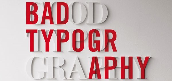
 Over the past few years, any web developer worth their salt would have noticed a growing trend towards proper typography online. In case you are unaware, typography is all about the way in which text appears on the screen. Let’s take a little look at how this is revolutionizing the web.
Part of the reason as to why there has been a growing focus on the use of proper typography is to ensure that websites actually look good on mobile devices. As you know, mobile screens are incredibly small. It can therefore be difficult to read some fonts on it. This can be incredibly difficult for those who are crafting a responsive web design. They need to come up with a font style that not only looks fantastic on a computer but also on a mobile device. It needs to be easy to read, whilst at the same time injecting a bit of character onto the page. I am sure that very few web designers have paid as much attention to text as they do in this day and age.
There has also been a growing trend towards people using typography in order to catch the attention of people on their page. Many web designers are now using different font styles and colors as a way in which to draw people to their call to action. The difference in font really jars the reader and gets them to focus on exactly where the web designer wants the user to be focused. It is quite an effective technique. However, if you want to use it properly, you really do need to use it in moderation.
Another thing that typography looks at is to ensure that the reading experience is as smooth as possible. More and more information is putting placed online. As you may know, reading on a screen is incredibly difficult. Typography however looks at everything from the optimum space between letters all the way through to the optimum block size of text. By looking at this information the web designer will be able to keep the reader focused for long periods of time.
Websites, even the smaller ones, are starting to brand themselves more and more. In fact, many of the larger websites have fixed typography standards that they follow. This helps to create a sort of brand for themselves. This ensures that they are not only recognized by their logo, but also by the text that they write on their page.
If you are not going to be carrying out the web design yourself and are instead going to be working with a web designer then you really should not need to know that much about the way in which typography works online. You just need to trust that they are going to do the job properly and that they are putting a lot of thought into not only the design of your site, but the way in which the text appears.
[box title=”Author Info” color=”#f00″]Kory Chesier is a professional blog writer, writes for HireaWiz a leading Phoenix web development specializing in custom web design, PHP development, Pay Per Click Marketing and Search Engine Optimization.[/box]

Some great points here on the benefits of Typography and it’s importance. I can completely preach the importance of having Typography that works for both a website in it’s general form on a computer, as well for the mobile view. I’m very guilty of being turned off when a website has a great font and then I open it up on the mobile device and it’s not compatible with how I’m viewing it. The result is either the font looking terrible on my phone, or it being replaced with a generic font; one that may fit better but is usually pretty awful. However at the same time, that could just be me being a little snobby, but I will always be more inclined to give the information on a website a chance if the website itself is visually attractive. The way to my heart is totally through my eyes!