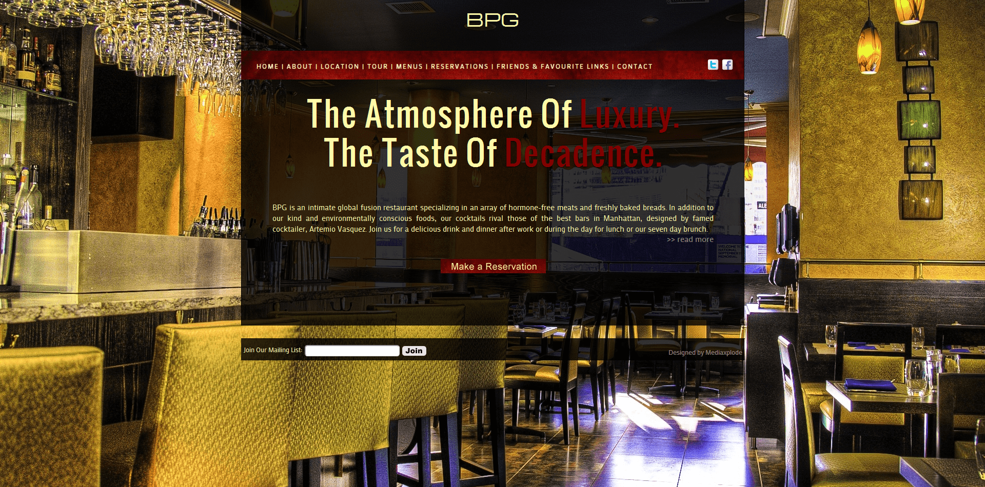
As Blue Planet Grill grew their concept changed slightly – progressing from a modern age restaurant to a more elegant dining establishment. As such the original, bright, and funky design had to be changed for something more elegant, yet still modern. The sliding background images were kept for the main page, however rather than having the images simply change in the background, they have been set to scroll themselves, and then rotate to the next image. The main color has changed from blue to maroon, and as you can see the restaurant name is now simply BPG NYC. The online ordering system was taken offline for the time being, however a backend system is still setup to maintain up to date menu’s for the site. Tabbed content is used throughout the site to feature as much content as possible within the same sized content area to maintain the same look and feel to each page. For comparison purposes here is a shot of the previous design:
And now the new one (which you can check out live at http://bpgnyc.com):


