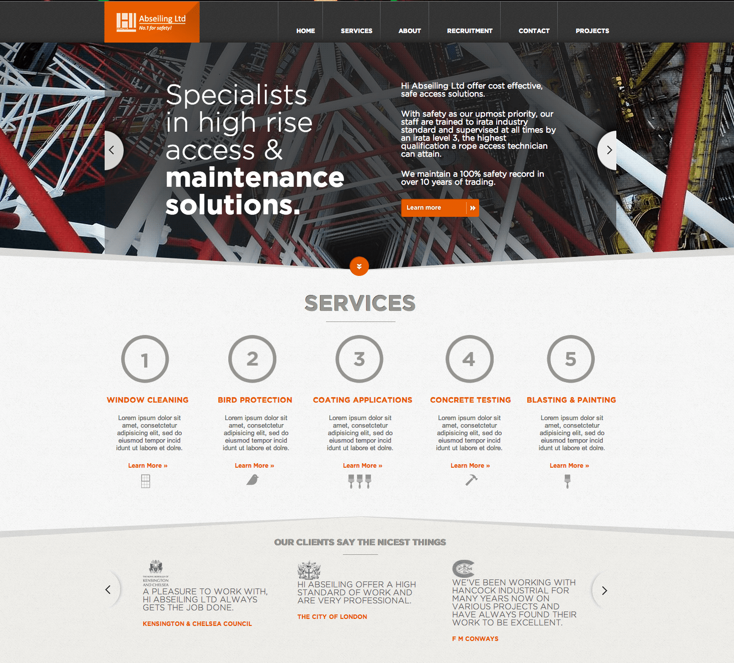
I am finishing up work on two custom WordPress based websites – one is a complete redesign of the ONEighty NYC website; and the other is a redesign of the HI Abseiling website. We’ll kick-start with the website for HI Abseiling, one of London’s premier window cleaning providers. HI Abseiling also supply an array of in house services such as mastic application, glazing replacement and anchor bolt testing, including many bespoke applications. Consistent quality of service and a streamlined accounts procedure are distinct advantages for our clients. Prior to this redesign I have worked with HI Abseiling with their old website, a template based WordPress site. The new redesign however would be a complete custom WordPress design – built from scratch.
Above is the layout for the homepage – which features a custom slider in the header section, fully controllable from within the WordPress backend. Furthermore the entire homepage is widgetized, including the “Our Clients Say The Nicest Things” testimonial carousel. This makes editing and further website work extremely easy for my client.
The rest of the pages feature a custom header image and header text for each of the pages – along with page-specific templates for single column, and two-column page layouts.
Moving on comes the website for ONEighty, an Automotive shop located in Brooklyn, NY that specializes in custom headlights. I have worked with them in the past – handling the redesign and maintenance of their G35NYC forums, the launch of the ONEighty Automotive Image Hosting site, and the maintenance of their current website. However the current website for ONEighty does not feature any way to sell any of the products that ONEighty has – and provides very limited information about their vast amount of work. This is where I came in – planning and developing a completely new website, built from scratch, with plenty of unique features.
The homepage features a top header slider, along with 2 navigation menus above and below the slider. Underneath that is a carousel of various associated vendors, along with links to the various service/product pages, and a featured post area.
As with the design for HI Abseiling, each inner page features a custom header image to showcase what page you are viewing. The Blog page displays a simple and clean listing of all the blog posts, along with sharing buttons to quickly share each post. Next is the Gallery page – which features a categorized portfolio, and images that are desaturated when they are not hovered upon.
All of this is handled via custom written page templates and shortcode functions to make sure that the client can, in the future, handle doing any updates and changes to their site on their own.
Once both sites go live, you’ll be able to find them listed within the Rapid Purple Portfolio on here.


