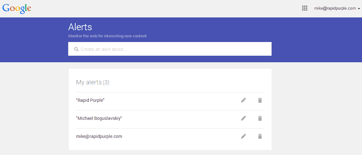
Google Alerts always seemed to have a rather primitive design to it – and that may very well have been the cause behind it never really gaining the popularity that it should have. Google has taken note of this and this past weekend have released a brand new design for the Google Alerts site. The core functionality of what and where you subscribe to things has not changed however the user interface has underwent a rather drastic change.
For comparison purposes here is a screenshot of the old Google Alerts site:


