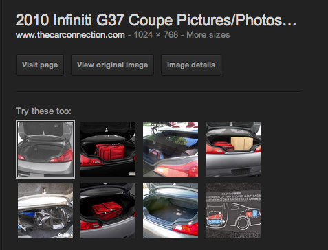
At the end of January Google released their first big change to the layout of Google Images providing a more streamlined process – changing their Google Images layout to now display the a preview of the image directly inline with the image you clicked on. However this morning when I went to run a search on Google Images I noticed something different. The lefthandside image is as per the “usual” interface however you will note that they are displaying “Try these too”.
When one of those images are clicked they automatically appear on the lefthand side. The thumbnails that are displayed are cache’d thumbnails served from Google’s own servers, however the large image displayed on the lefthand side is still hotlinked from the image owners servers. So for webmasters, this once again isn’t necessarily the happiest of things – however from a usability aspect this makes searching and browsing images much easier and faster. Have you seen the new update to Google Images yet? Let me know what you think of it in the comments.

