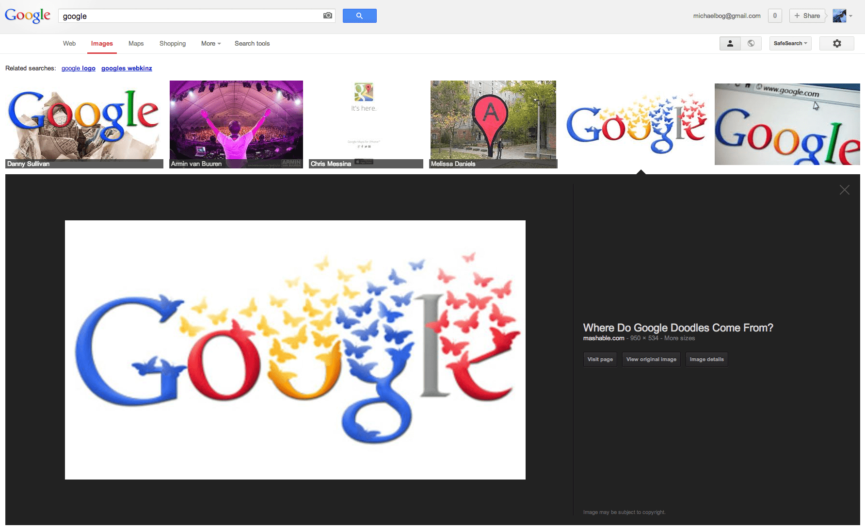
Remember how the old Google Images would work? You would click on a picture, a new page would load with the picture in it, and barely any information – along with a link to view the original image. Google has decided to streamline this whole process a little bit – changing their Google Images layout to now display the a preview of the image directly inline with the image you clicked on. For people browsing for images – this is great as it makes your life that much easier, with less clicks. For a webmaster however, this can be a nightmare.

The new Google Images layout started to roll out earlier this week, and many webmasters who focus in large on search traffic from their gallery listings within Google Images have noticed quiet a decline in click-through traffic to their websites. Furthermore the new preview displays the image directly from the server it’s hosted on, not from Google’s cache – so you’ll probably also see an increase in direct image requests to your server. What do you think of the new Google Images

Love this new layout. Its much better for the average user. I used to hate the old google image layout because of being redirected to an entire webpage every time I wanted to just view an image.
I now see a much larger preview (instead of the useless tiny one you used to get when hovering the mouse) And I’m glad the hover feature appears to be gone. It was annoying when you hovered over images you didn’t want to preview as it was distracting when they enlarged. This big preview, where it opens on a black background, is much more focused on the image unlike the previous little pop up previews. Also click-for-preview is much better than hover-for-preview since its more instant than hovering.
Most of all I love that you don’t have to be redirected to the entire website when all you want is one image. I used to find that very annoying because the webpage is irrelevant not to mention distracting in the background when you just want the image. Especially when you often got redirected to websites you wouldn’t normally want to view except for one image, sometimes undesirable sites. I know they were faded out but still very visible and your browser had to load them. Who wants to unnecessarily load a cluttered full webpage for every single image they view?
The fact that webmasters have noticed a decline in hits since people are no longer forced to load their webpages for every image clearly highlights that PEOPLE DON’T WANT TO VIEW YOUR WEBPAGE each time they view an image. They just want the picture. If this bothers you that you are no longer getting forced hits then take your site off google, more of a loss to you than to google since good luck getting ANY hits without being listed on google. If people WANT to view your webpage they still can and will with the link provided so quit whining.
And the fact that there’s a button so you can easily see the image full size means there’s no problems here at all. For once a google change I really like. I hope it stays.
I wanted to wait a little bit, and really give this new layout some use before I posted a reply. To be honest – after using it these past 2 weeks – I couldn’t agree with you more. It’s EXTREMELY convenient to no longer have to redirect to a new page and then scroll through it to view an image properly. The new GUI is alot smoother i’ve noticed as-well – especially if I am running Photoshop and Chrome with a ton of open tabs – on my netbook …
I haven’t noticed much of a decline in traffic here at Rapid Purple – however this sites traffic was never really focused on Image Search.
Thank you for the very well written response.