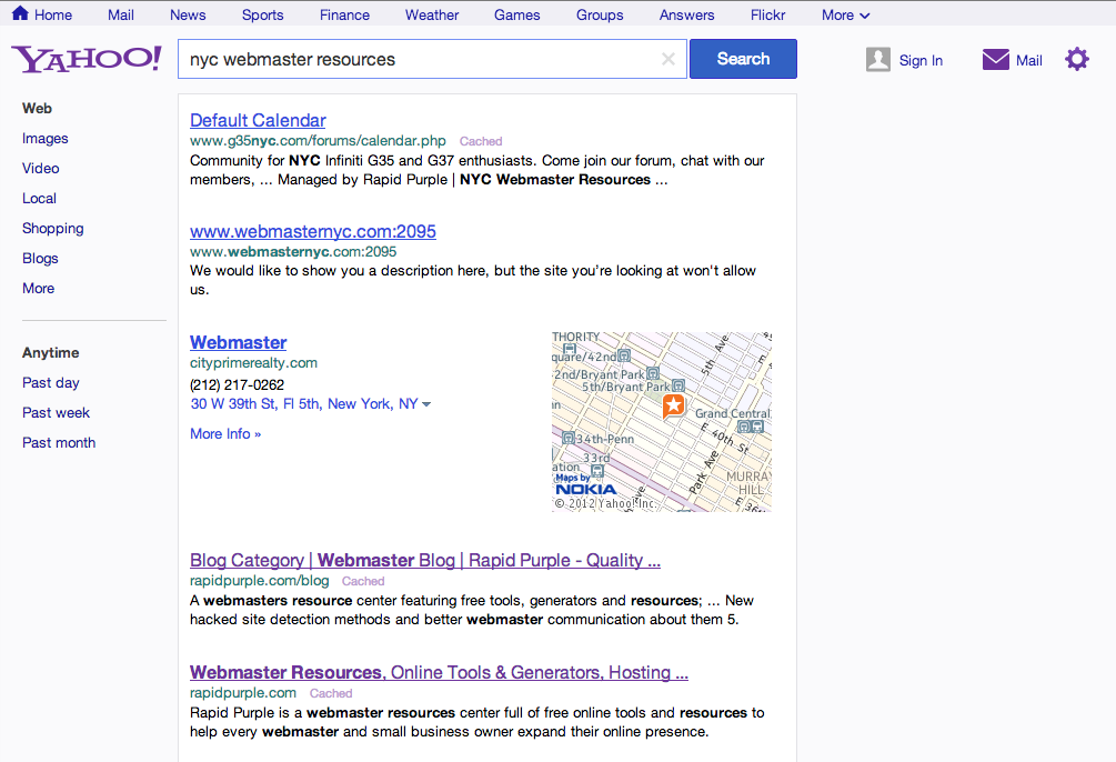
In a post on the Yahoo! Tumblr yesterday, Yahoo! SVP of Search – Laurie Mann announced a fresh new redesign of the U.S. Yahoo search engine. The redesign introduces a much more cleaner and modern look, with a new top navigational bar, and more real-estate available for search results.
When it comes to search, nothing should stand between you and your results. That’s why we’ve placed search results higher on the page. And thanks to some under-the-hood performance improvements, many of you will notice that the page also loads faster. We’re also introducing a new navigation bar at the top of the page so you can easily browse other Yahoo! sites. Over time, we’ll be rolling out the navigation bar across more Yahoo! properties.
The new design ties into the look of the Yahoo! homepage which was redesigned a few months back, and helps to develop a more uniform feel as you browse across all of the Yahoo! properties. Yahoo! has provided a great comparison photo of their new search design as compared to their old one:

