While everyone is focused on the first successful test flight of Aquila, the solar airplane Facebook designed to bring internet access to people living in remote locations – Facebook was busy beginning the roll-out of a brand new design for business pages – offering a much more open look and feel, and finally letting page managers use the entire real estate provided by their cover photo.
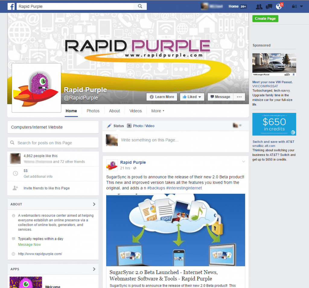
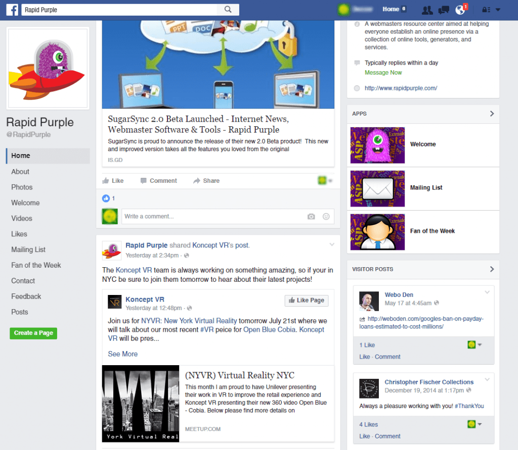
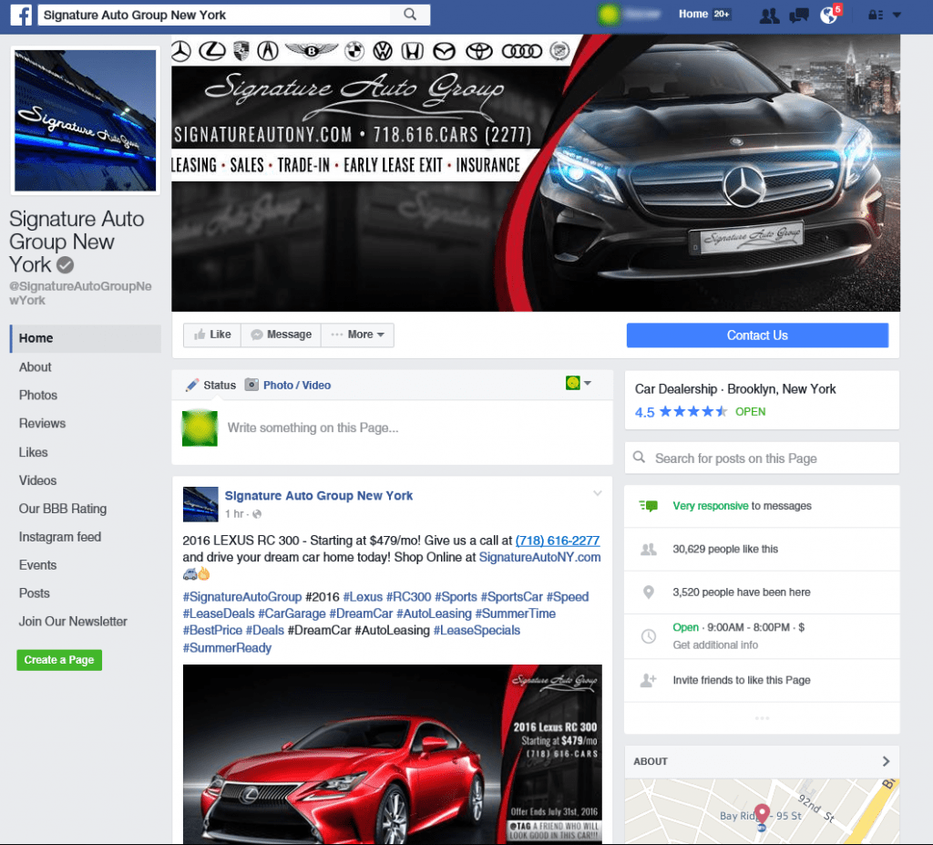
The new layout makes some drastic changes to the way business pages look. First off the navigation tab is now moved over to the left side, which now lets all of your different page apps/sections be visible without a user having to click on the More drop-down first. Furthermore the page call-to-action button is now much more distinguished as it has been made significantly larger and now has the Facebook blue as a background color.
The original left sidebar has been moved over to the right side of the page, otherwise retaining the same layout and structure.
Finally the page title, username, and avatar have been moved above the newly created left sidebar – thus allowing your entire cover photo to be visible in all of it’s glory. Plus this means you can now use the entire cover photo for promotions and advertisements, without worrying about them being cut off by your overlapping avatar.
The new Facebook pages view began rolling out today, so if you don’t see it yet just wait a few days. That being said social media managers should give it a few days before rushing to design new cover photos since you want the new page design to roll-out to everyone first.


