One of the primary implications of a well-organized / good website, is to keep your visitors on the website. A website is definitively created for a purpose, unless intended for personal use, which is the minority in this situation. For example, a portfolio website would want to be visited and it’s content viewed. For companies and internet businesses, your website certainly aims to provide product information, to make sales, or somewhat similar. However, most individuals undoubtedly prefer visually captivating designs, so on and so forth. It is undeniable that this causes no harm, but one must put himself/herself in other people’s shoes, as to understand how a visitor to the website might think, do and react.
As I have mentioned on the Web Development Services page, a web designer has to learn how to think the way your visitors think – which directly ties into setting up a good website navigation design. Let’s look at two different scenarios:
Situation A : Website with good navigation design ( 2-3 hyperlinks to target page ), well planned in terms of placement, and design.
Situation B : Website with poor navigation design ( takes forever for the visitor to reach his/her target page ), hard-to-read navigation fonts and poor placement of the navigation buttons/bar.
In Situation A, a visitor will always be able to access his/her target page. For example, the individual comes across your website, and is interested in the product sold, but wants to find more information. He/she finds the navigation with no trouble, and enters the particular product information page.
As for Situation B, a visitor stumbles into the website, and would also like to find out more information about the product. Unfortunately, due to bad placement and fanciful font-types, the visitor takes forever, or even fails to find the navigation bar. Even when he/she does so, links to the product information are nowhere to be found, (example : home > about > products > product image > etc…[a few more clicks] > product information ).
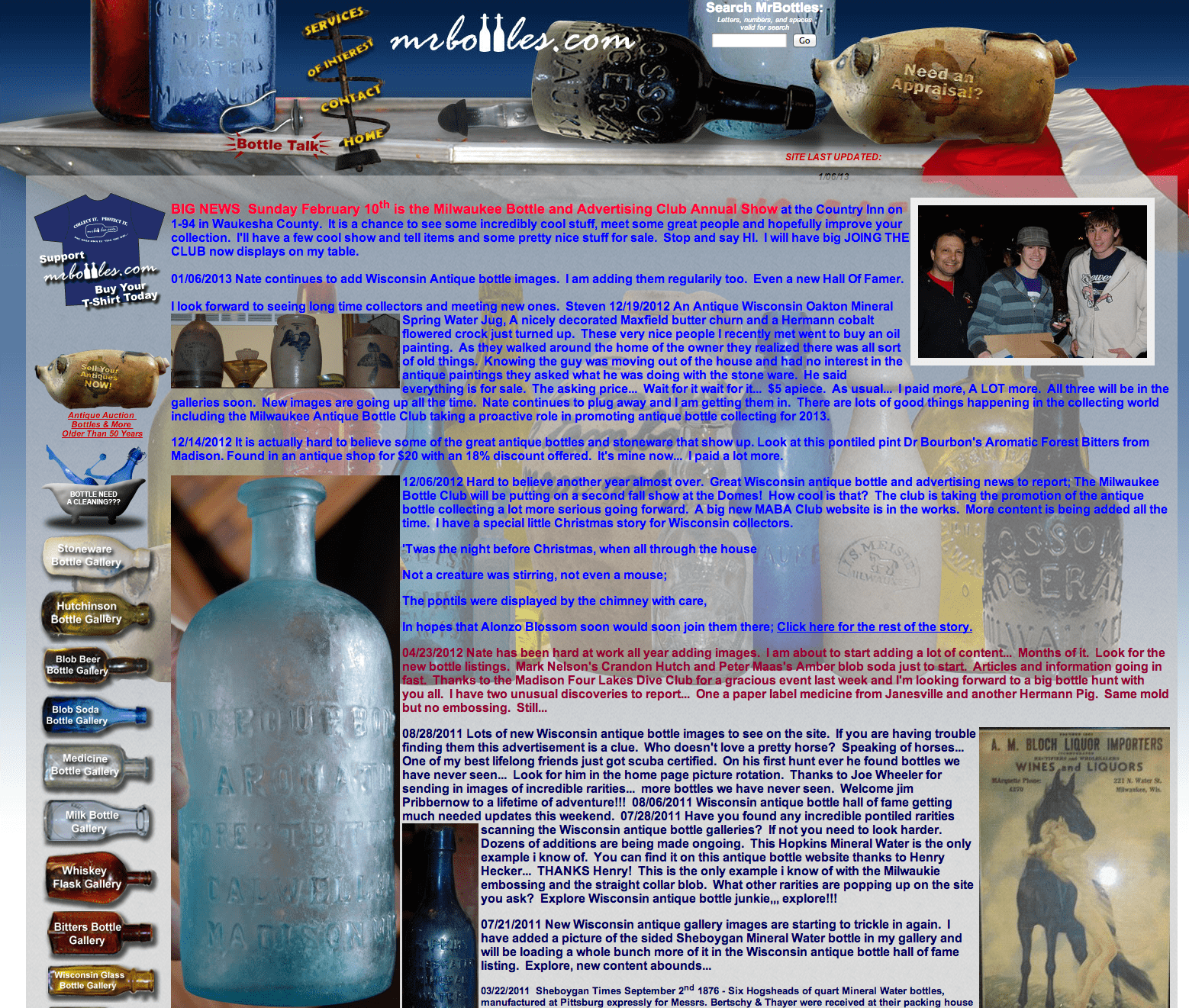
Let’s take a look at the following real life example: http://www.mrbottles.com. There are 2 navigation area’s here – but they take a little while to seperate away from the rest of the website. The first area is towards the top which lists links to the homepage, contact page, and services pages. Then there’s “bottle talk” which is also a link – not that you would know about it unless you accidentally hover over it. The same applies to the “Need an Appraisal?” image – which is also a navigational link. Moving on we have the side navigation menu – which lists all of the different galleries on this site. Completely separate from the main navigation located on top, however it also features a link to sell your antique/get an appraisal.

It should be obvious by now why a clean navigation is so important for your website, and why in the long run your website visitors will thank you for it – even if you think the fancy graphics and fonts you want to use look awesome. A good, organized, and structured navigation actually keeps your visitor on your website longer – while clutter simply makes them want to leave.