Did the Google homepage look strange to you this morning – but you couldn’t place what was different? Sure there was a new animation for the logo – but we’ve all come to expect the Google Doodles. And yet something just felt different?
That’s because Google has, quietly, made their search box larger. Take a look at the below screenshots. On the left is how the search box looked in 2014, and on the right is how it looked this morning.
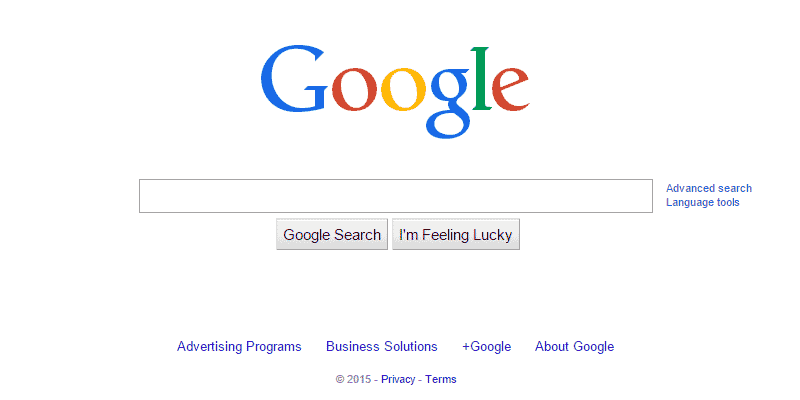
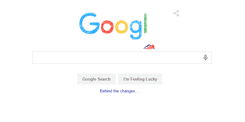
The change also applies to the actual search results page also where the search bar gets a clear increase in height and inner padding. Overall it’s a cleaner look – and these little changes actually make a a big change in the overall feel of any website.

Notice anything else among the screenshots? That’s right. Google also has a new logo.
![]()