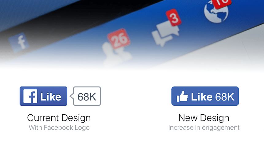
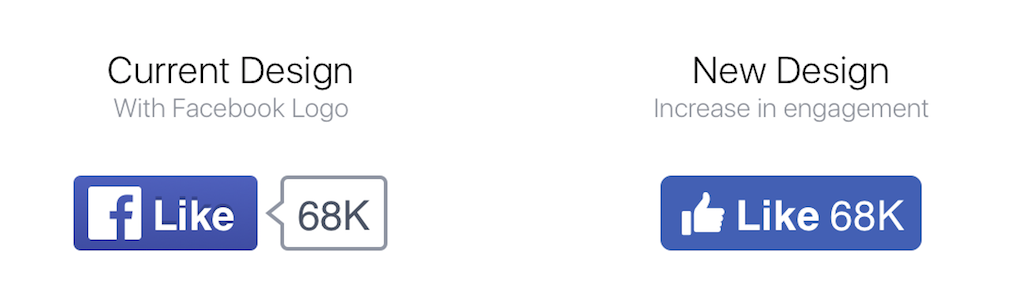
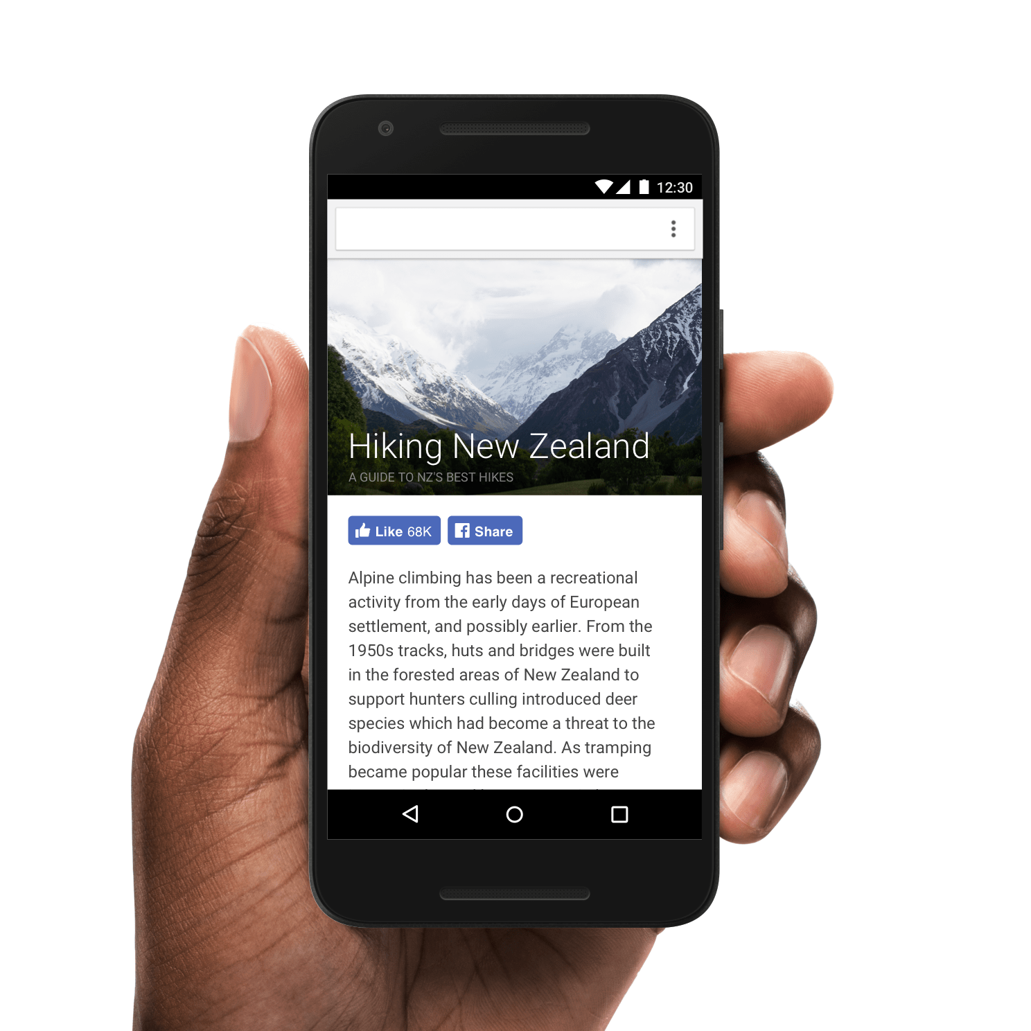
Facebook has just launched the redesigned LIKE and SHARE buttons, getting rid of the iconic Facebook icon-logo, gaining an emoji-style thumbs up icon, and merging the count right into the button to create a flatter, more modern, and more noticeable button.
The new design is actually part of a much larger redesign of the Facebook social plugins. As such the new buttons, are accompanied by new buttons and icons for FOLLOW, RECOMMEND, and SAVE TO FACEBOOK.

Furthermore Facebook has announced that in the next couple of weeks they will be adding buttons for liking, sharing, and commenting to they’re fast-loading Instant Articles format.
In the coming weeks, Instant Articles publishers will be able to add Like, Comment, and Share buttons to the bottom of their Instant Articles, and interactions with these buttons will be included in aggregate Like and Share counts.
Luckily, while kicking off all of these changes Facebook made sure that the new changes were completely backwards compatible – and as such you as a webmaster should not have to make any change to your currently embedded code. The new designs will work with any and all previous configurations for any of these Facebook social plugins.
Now, as pretty as the new buttons and icons look – the big question you’re probably asking right now is WHY? What was the point of all this Facebook? Well, Facebook has a pretty good reason for why they implemented these changes, and it actually goes a long way towards helping you. Here’s what Facebook has to answer:
The Like and Share buttons both use the Facebook “f” logo today. Our hypothesis was that more people would understand the thumbs up icon on the Like button, so we conducted qualitative and quantitative tests to measure them side-by-side. The results revealed an increase in engagement, so we are switching the Like button from the Facebook “f” logo to the thumbs up icon.
So, in layman terms – the new buttons are more likely to be clicked than the old buttons. Whether that’s solely because it’s something new and human nature makes us want to click the new button, or it’s actually because of the new design, will stand to be discovered. However from the buttons I have seen so far across Facebook and various sites, I like the new modern buttons more than the old ones. I am not clicking them any more or less than the old ones, but I do like how they look.
What do you think of the new Facebook social plugins design? Share your thoughts in the comments below.