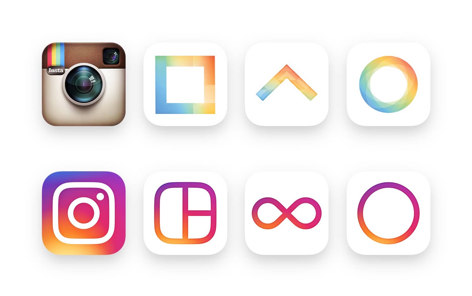
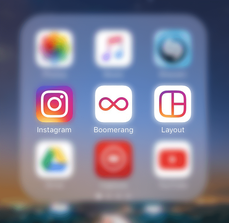
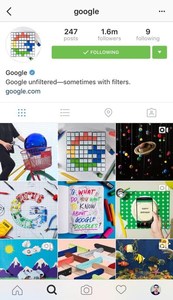
Lately Instagram has been going through some serious changes, updating their app layout to a sleeker, brighter, and more open design – featuring plenty of whitespace and simple black icons. Today the Instagram suite of apps also gets a brand new logo design – heading the completely opposite direction of their recent app redesign and introducing a rainbow-themed set of logo’s for their apps.
This is the first branding redesign for Instagram, and I must say they carried it out very well. The new UI for their apps is clean and simple, while the logo is all about the colorful and graphically appealing things you will find within them. There’s also been some amazing attention to detail during this redesign process which you might not even notice at first. For example – Instagram made sure to use standard system fonts and icons within their Android & iOS applications to ensure a smooth and familiar feel for all users.
Ian Spalter, Head of Design at Instagram, wrote in a Medium post:
While the icon is a colorful doorway into the Instagram app, once inside the app, we believe the color should come directly from the community’s photos and videos. We stripped the color and noise from surfaces where people’s content should take center stage, and boosted color on other surfaces like sign up flows and home screens.
Make sure you update your apps to see the latest UI and branding changes. What do you think of the new look?


