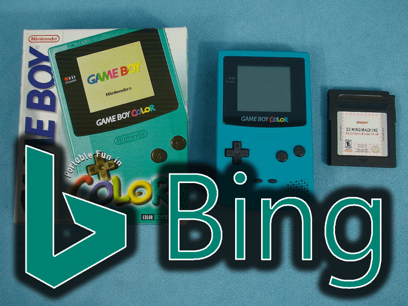
Bing, without much fuss, has rolled out a new logo – switching from a bright yellow to a teal color reminiscent of an old Gameboy Color. Check out the new Bing logo below:
According to the original AdAge report, Microsoft states that the change from yellow is due to green being “easier to see over yellow.” The newly capitalized B however means that Bing is growing up – which makes sense considering that it’s finally turned a profit for Microsoft – and now is being given some serious attention. Rik van der Kooi, Microsoft’s chief of search advertising, has clearly stated that the company is “all in on search” and working to expand Bing’s reach and audience – and apparently a new logo was the way to kick things off.
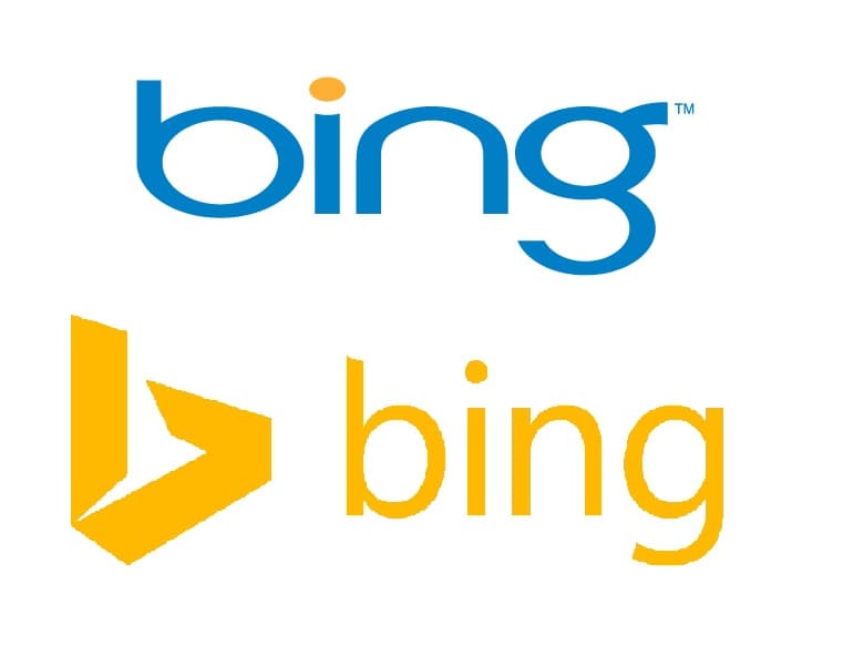
Meanwhile take a look at some of the old Bing logo’s:


