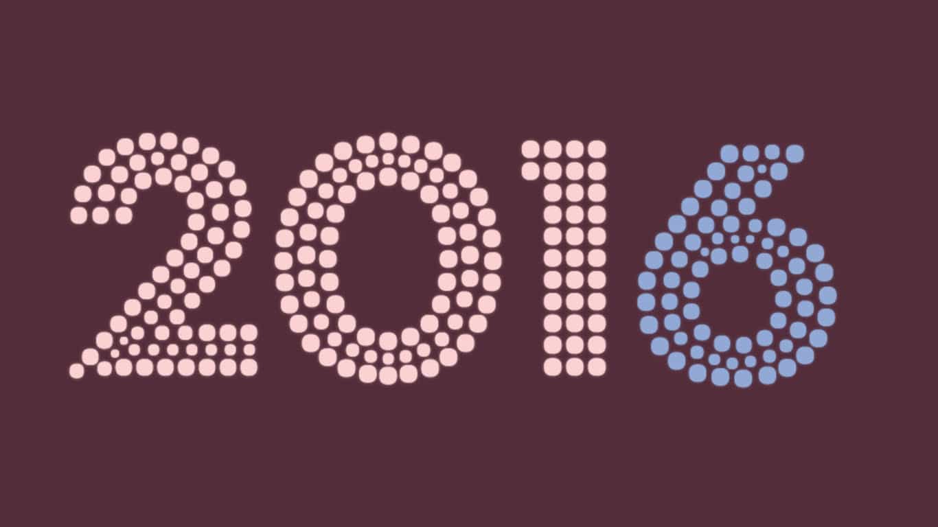
At the end of every year it has become tradition that Pantone picks out a color for the upcoming year. As you can see, its the end of the year, and as tradition calls for Pantone has chosen the Color of the Year for 2016 – or rather two colors. The colors selected, based on a slew of different factors, such as trend analysis, emerging techniques, and marketing, are 15-3919 Serenity and 13-1520 Rose Quartz.

Pantone very rarely selects two colors, and the sheer fact that this occurred symbolizes, to me at least, the death of flat design and the reintroduction of gradients. I mean just look at how beautiful the transition from Rose Quartz to Serenity looks in the graphic above. Alas we shall see what happens throughout 2016.
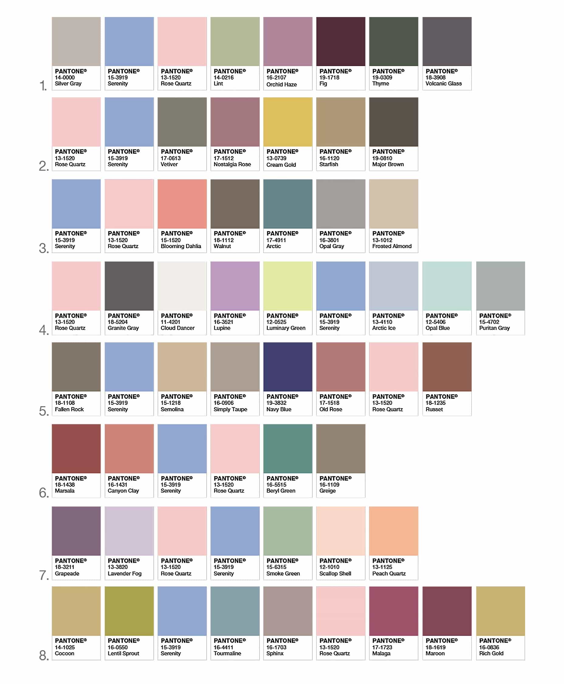
Apart from the newly selected colors, Pantone has also released a set of complimentary colors that pair along with Rose Quartz and Serenity: